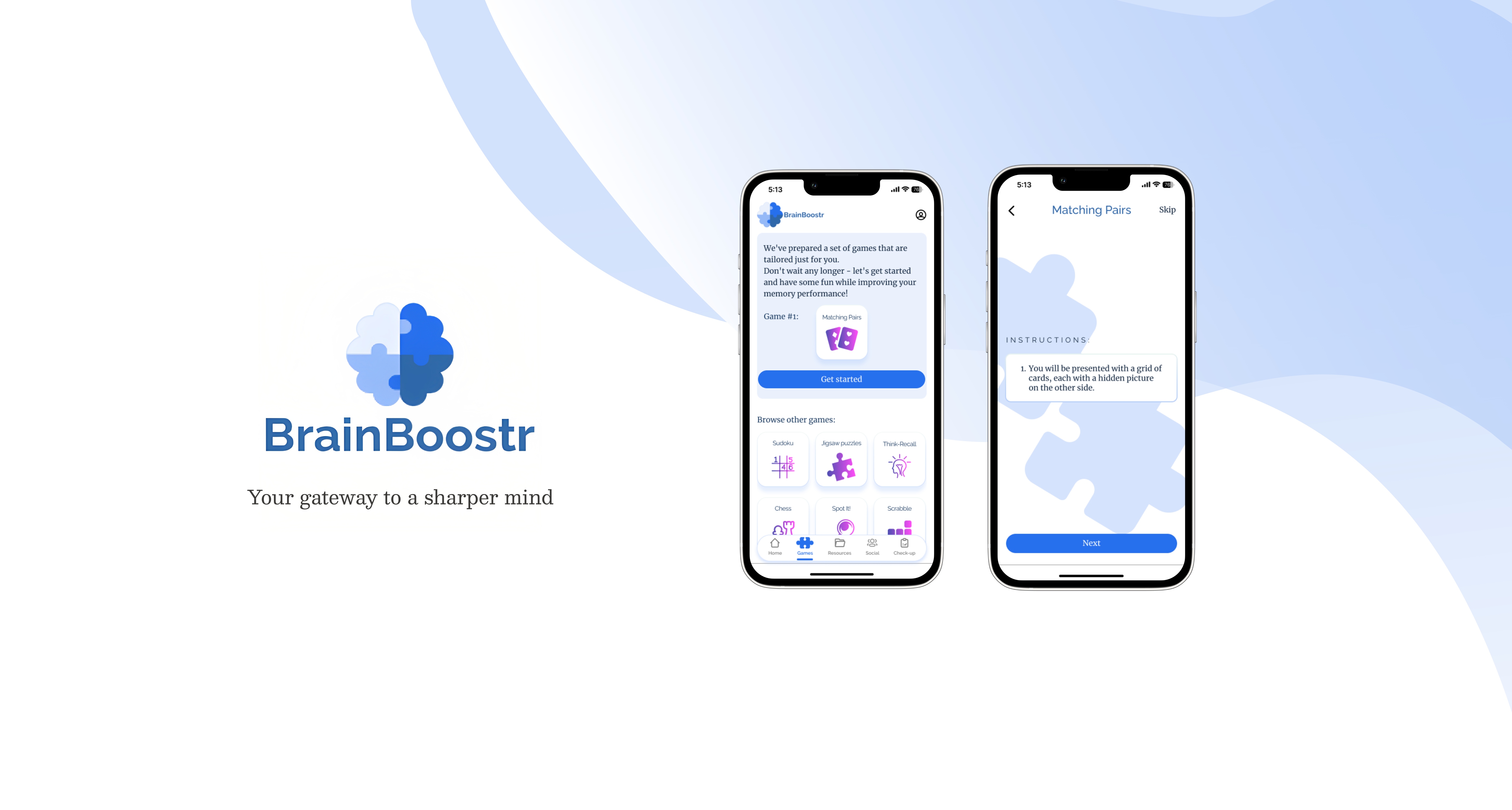
BrainBoostr Memory-Training App
BrainBoostr is a study project app I designed during my bootcamp. It helps individuals train their cognitive abilities to keep their minds sharp and reduce the risk of dementia in later life.
Introduction
First of all, I started by defining a problem:
Based on this, a problem statement and a hypothesis were created:
We will know this to be true when we see how many users use our app on a daily/weekly basis and leave good reviews.
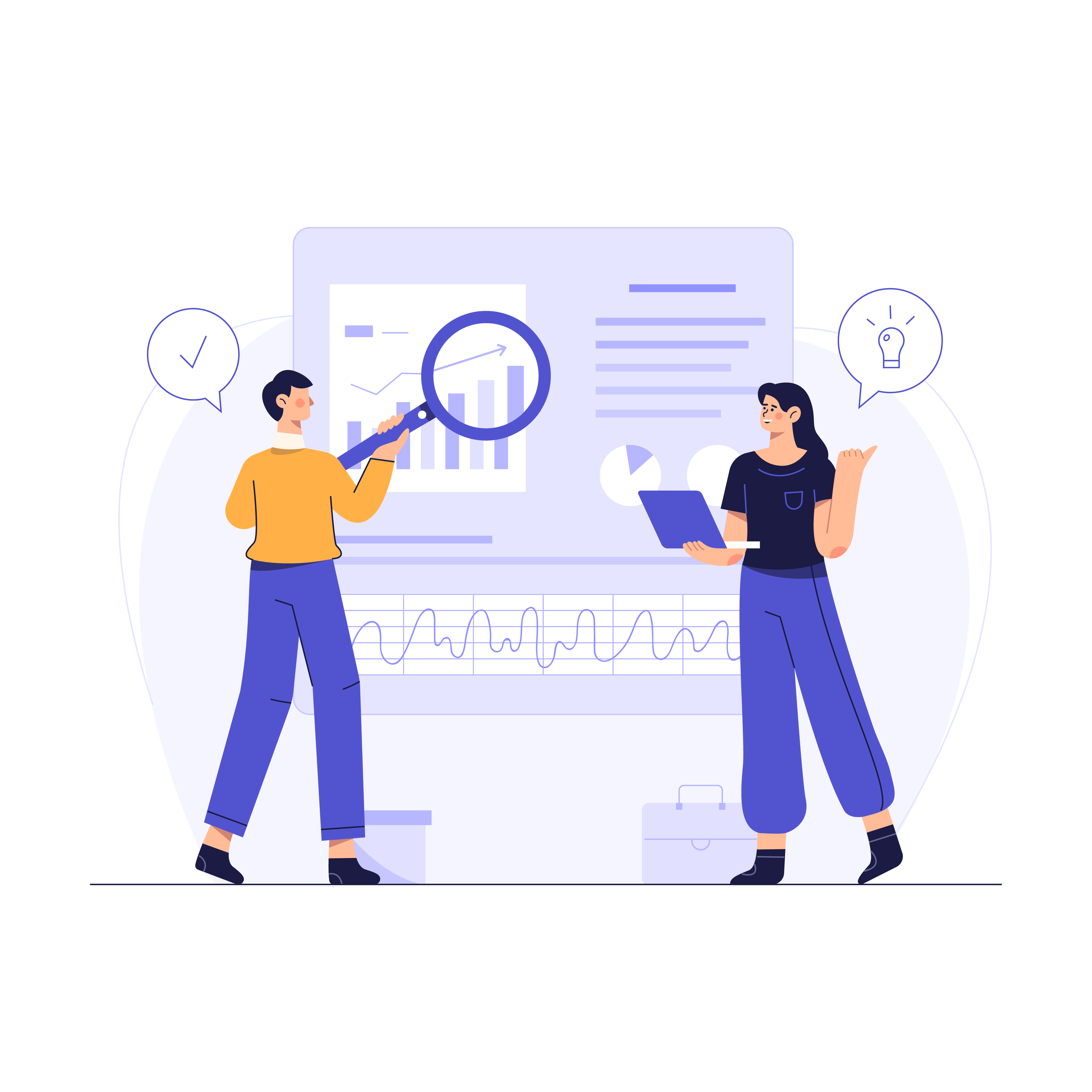
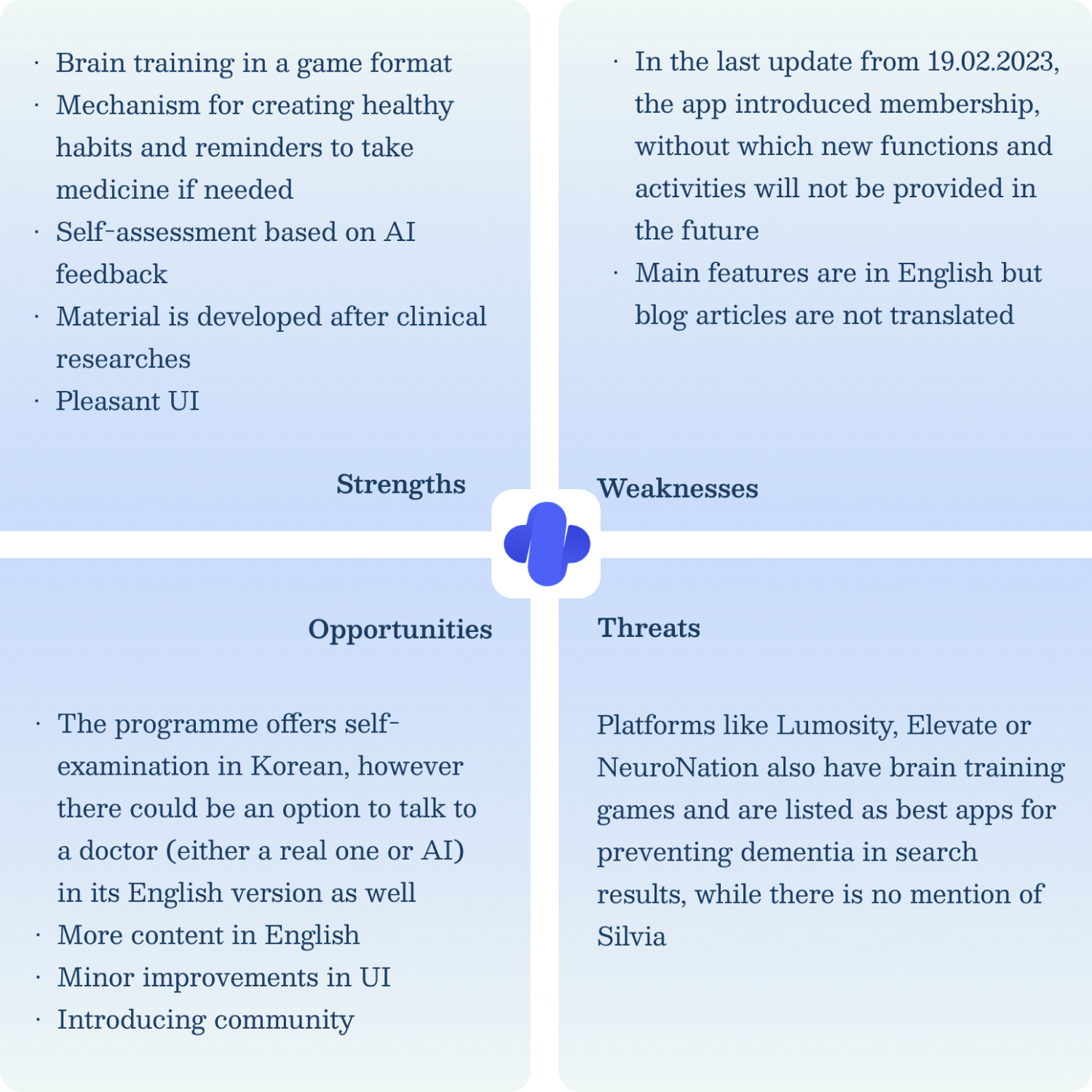
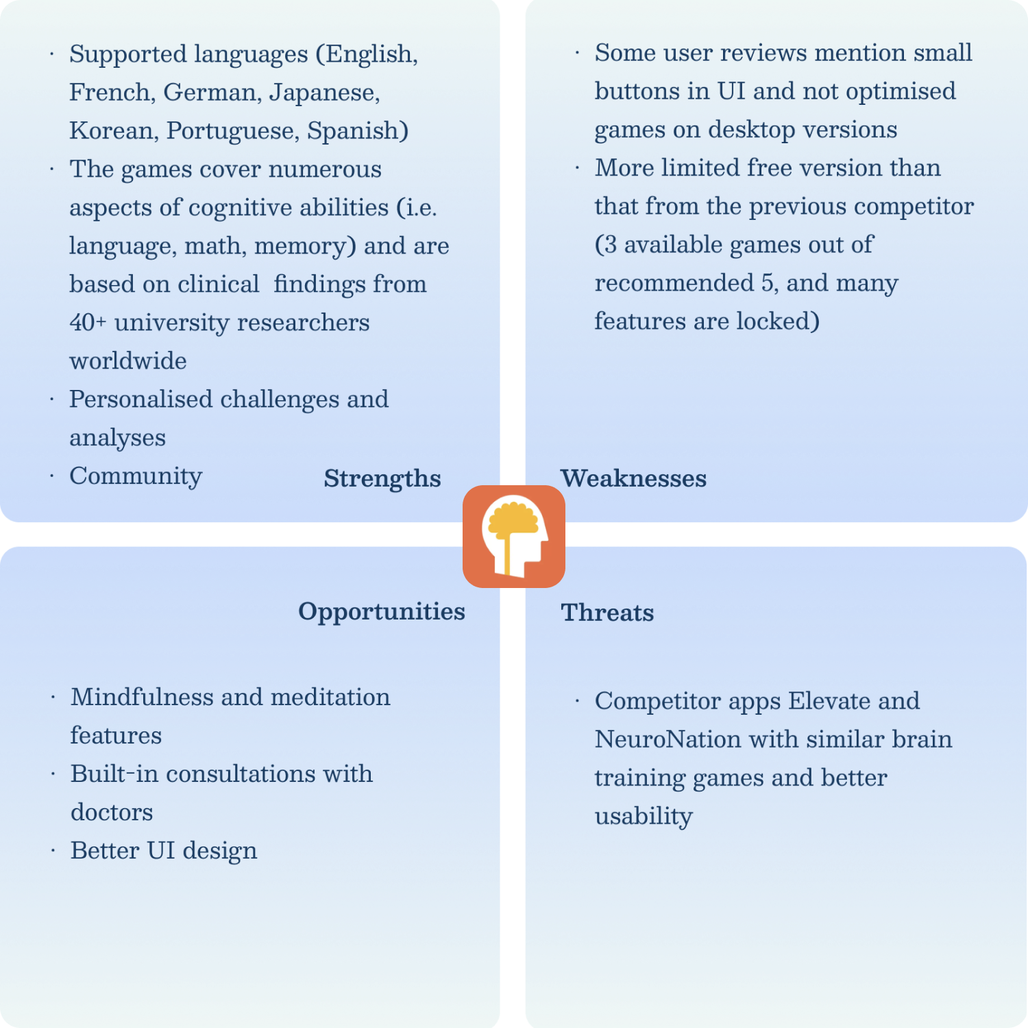
And to understand how existing products approach the problem, I have conducted a competitive analysis
The next step was launching screener surveys to
- learn about users' general awareness of memory and cognitive decline,
- to prepare the ground for interview scripts,
- to find individuals who qualify and may be potentially interested in interview participation.
Although I have received only 15 responses and we know this is not enough for surveys, they still helped to notice some common patterns in users' approach to the given problem.
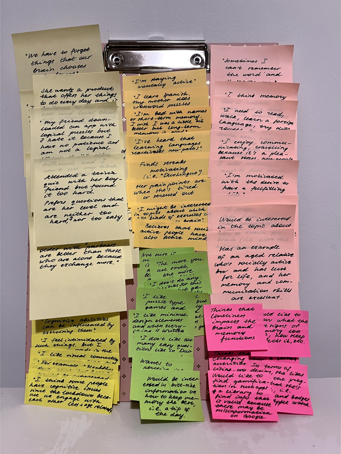
View results →To understand users' pain points, interests, motivation and preferences deeper, I have conducted 6 in-person and online interviews with individuals within the targeted age range who had tried before and/or are interested in brain-training activities such as solving crossword puzzles, learning foreign languages, etc. The unexpected takeaway for me was that some participants shared sensitive information about their experiences or cognitive health, and that made me think more about users' privacy, therefore their names or any other PII have not been mentioned anywhere.
Some insights from the user interviews include:
- Potential users have insignificant concerns about their cognitive abilities (for example, birthdays, phone numbers and short-term memory stuff) > so they need a tool that would motivate and strengthen their ability to memorise.
- Some users would be interested in information about how to test your brain or how to improve your memory in a video format or a bite-sized piece of text information > so they may benefit from a tip-of-the-day feature.
- Some users are discouraged by extra difficult and tedious or, on the contrary, very easy tasks > so they need a personal approach and tailored exercises for their preferred level and needs.
- Potential users like different activities that include puzzle-type games, crossword puzzles, learning foreign languages, gaming, communicating, walking, and performing tasks that require fine motor skills > so they need a product that will offer a selection of these activities.
- As for the design, potential users like visual connection to the content, gamified components (such as badges, streaks, achievements to close, positive feedback), a library with valid information, small lessons, and arrangement from easy to hard levels > so we can consider implementing these components into our project app.
- All interview participants believe that cognitive abilities can be influenced and memory loss can be slowed down to a certain degree through training your brain, healthy sleeping and nutrition exercising > so the product should help to integrate these activities into a daily or weekly routine.
- All of the participants also see a correlation between cognitive abilities performance and social engagement, especially in the older age > so the product can introduce announcements and registration for online and offline group events for like-minded individuals.
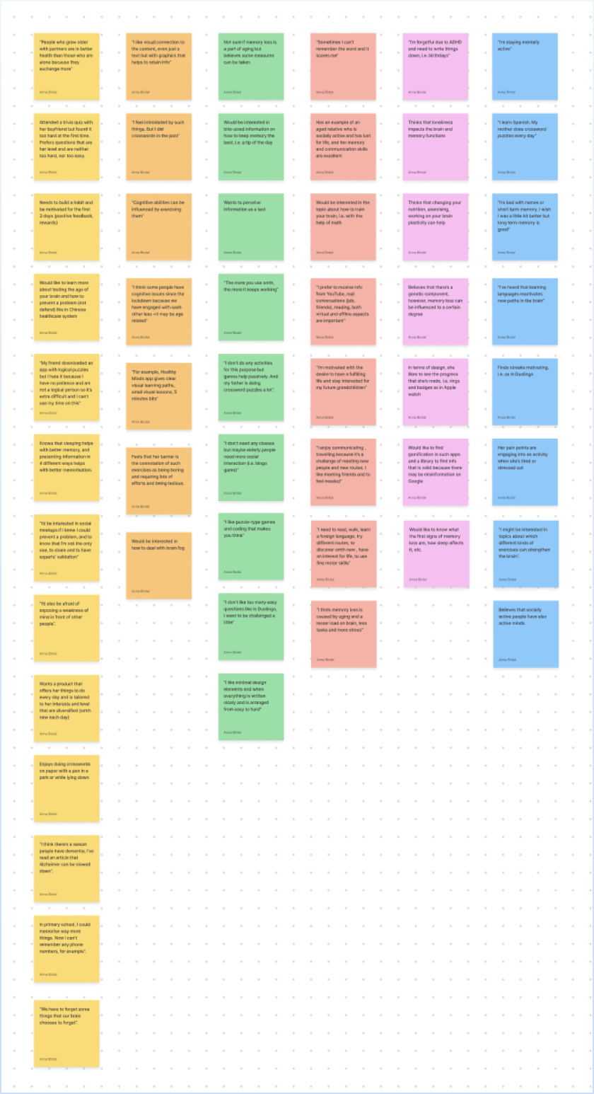
Collected data from the interviews has been organised in affinity and empathy maps (the larger version of the digital map can be viewed here):
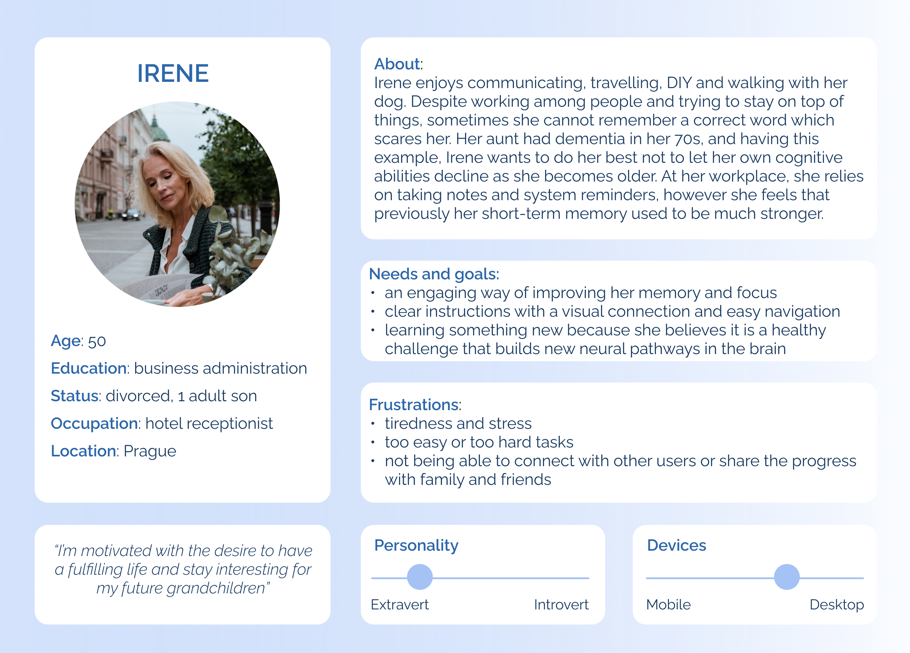
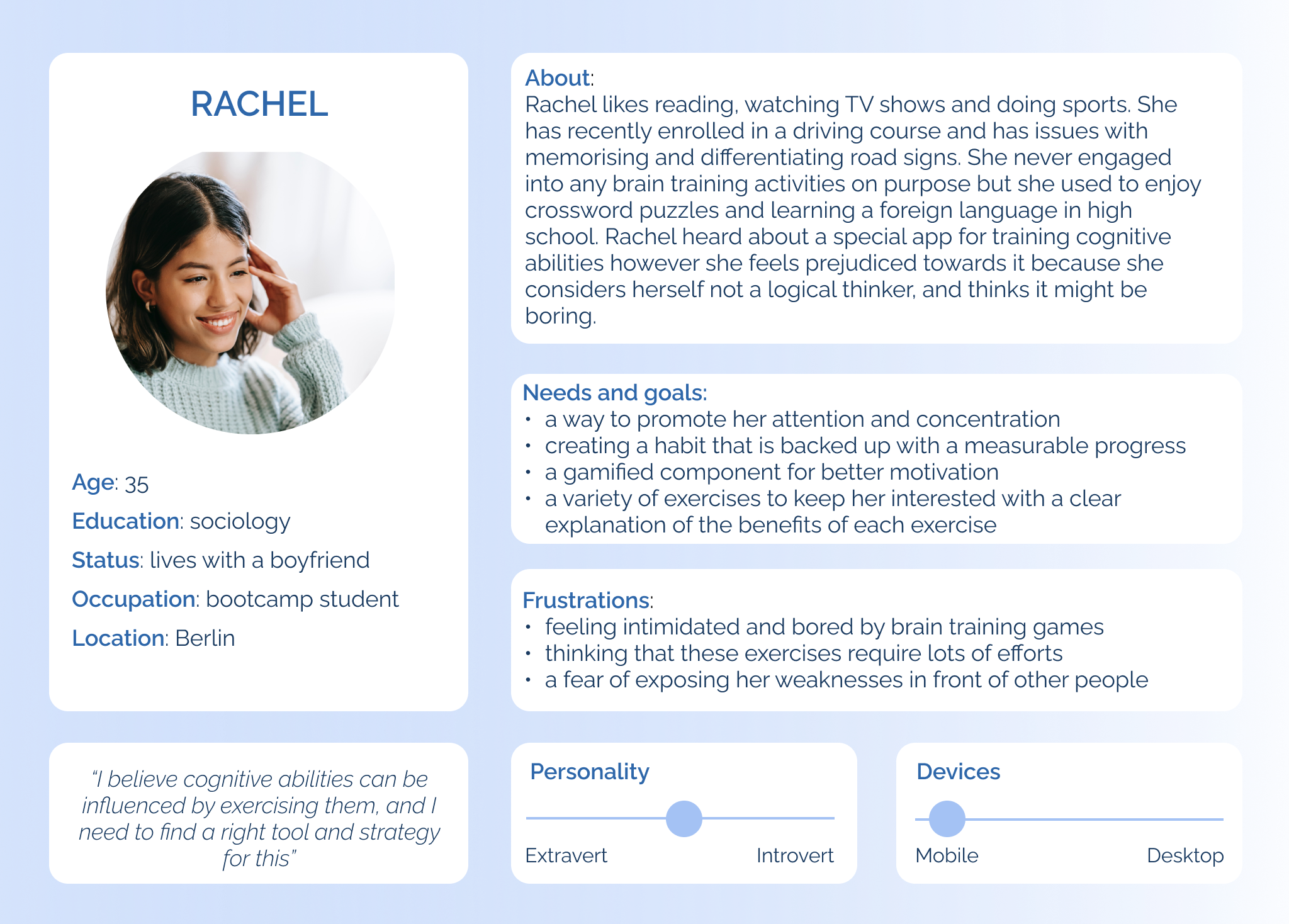
Based on the insights from the user interviews, I have created two user personas to see potential users as real people and to keep the focus on their needs, goals and frustrations while designing the app later:
To visualise a journey and experiences a potential user might have while trying to reach their goal in the app, I have created user journeys:
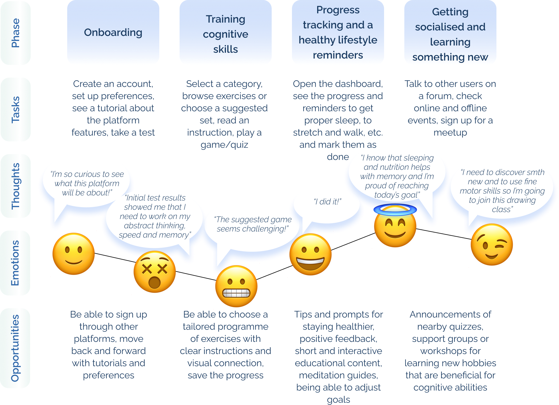
Check Rachel's user journey here.
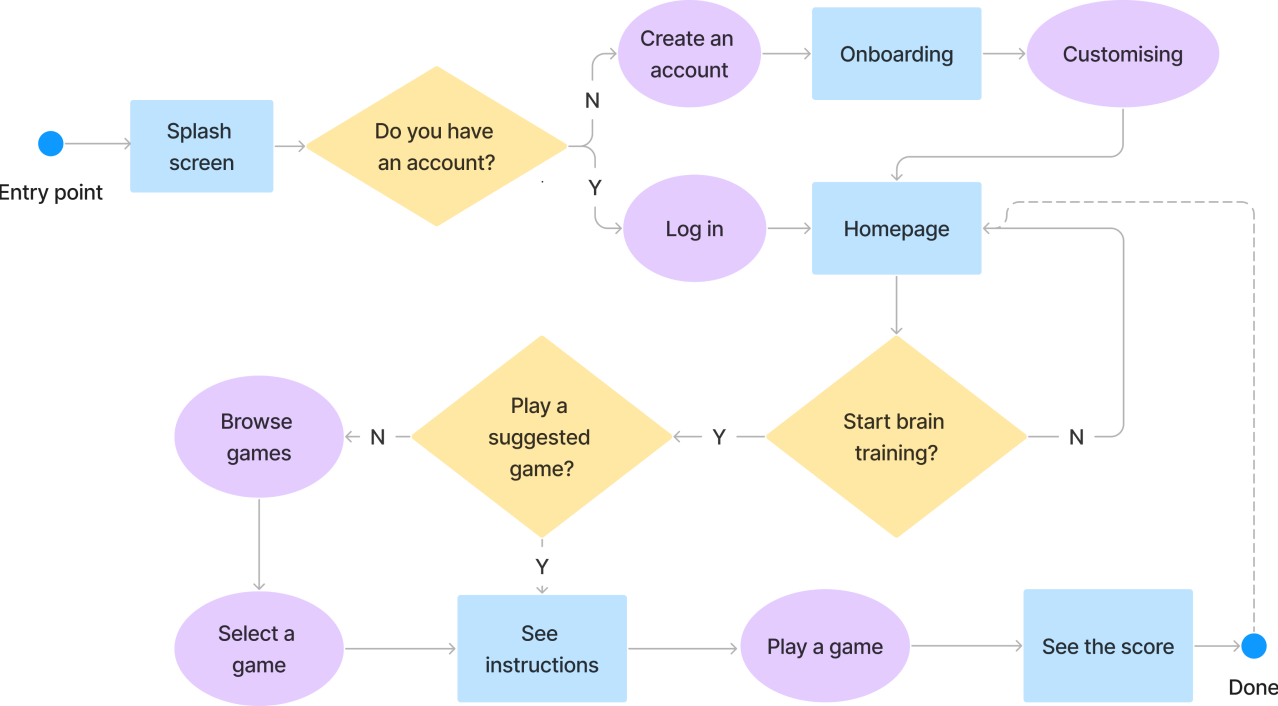
To understand potential users' interaction with the product and specific tasks they may complete, I mapped out three task and user flows on the example of the first persona:
TASK AND USER FLOW #1 FOR IRENE:
- Goal: sign up and start brain training
- Entry point: open the platform
- Success criteria: complete a daily brain-training exercise
- Launch BrainBoostr
- Create an account
- Log in
- Onboarding
- Answer questions to get a tailored brain-training exercise plan
- Play a brain-training game
The rest of the task and user flows can be viewed here.
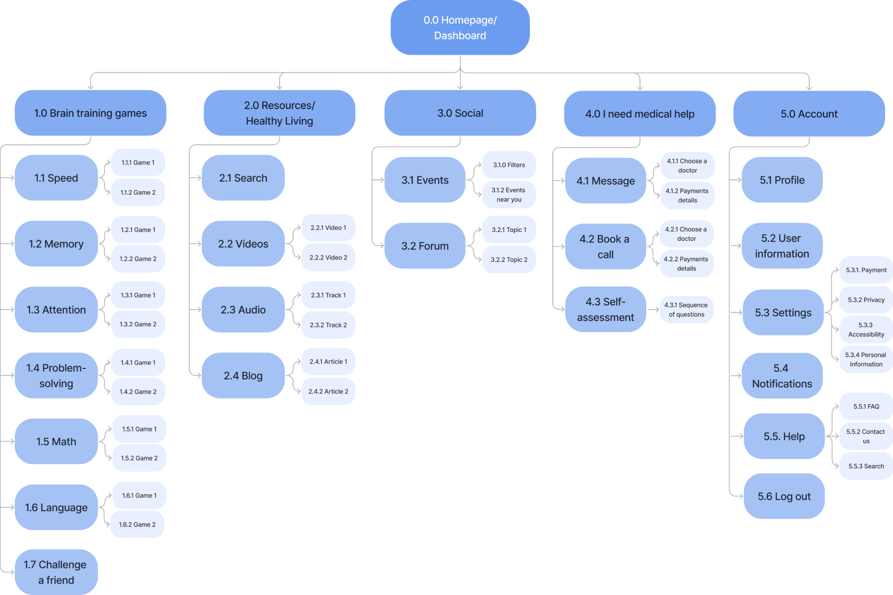
I was very excited to enter the ideation phase and started it by building a sitemap to understand how to structure the sections of my web app, how its content is going to be organised and how users will navigate through it. To validate these ideas, I have conducted open card sorting (check the full report of the process here) and after combining its results with my mentor's feedback, the IA of the app has been shaped into this:
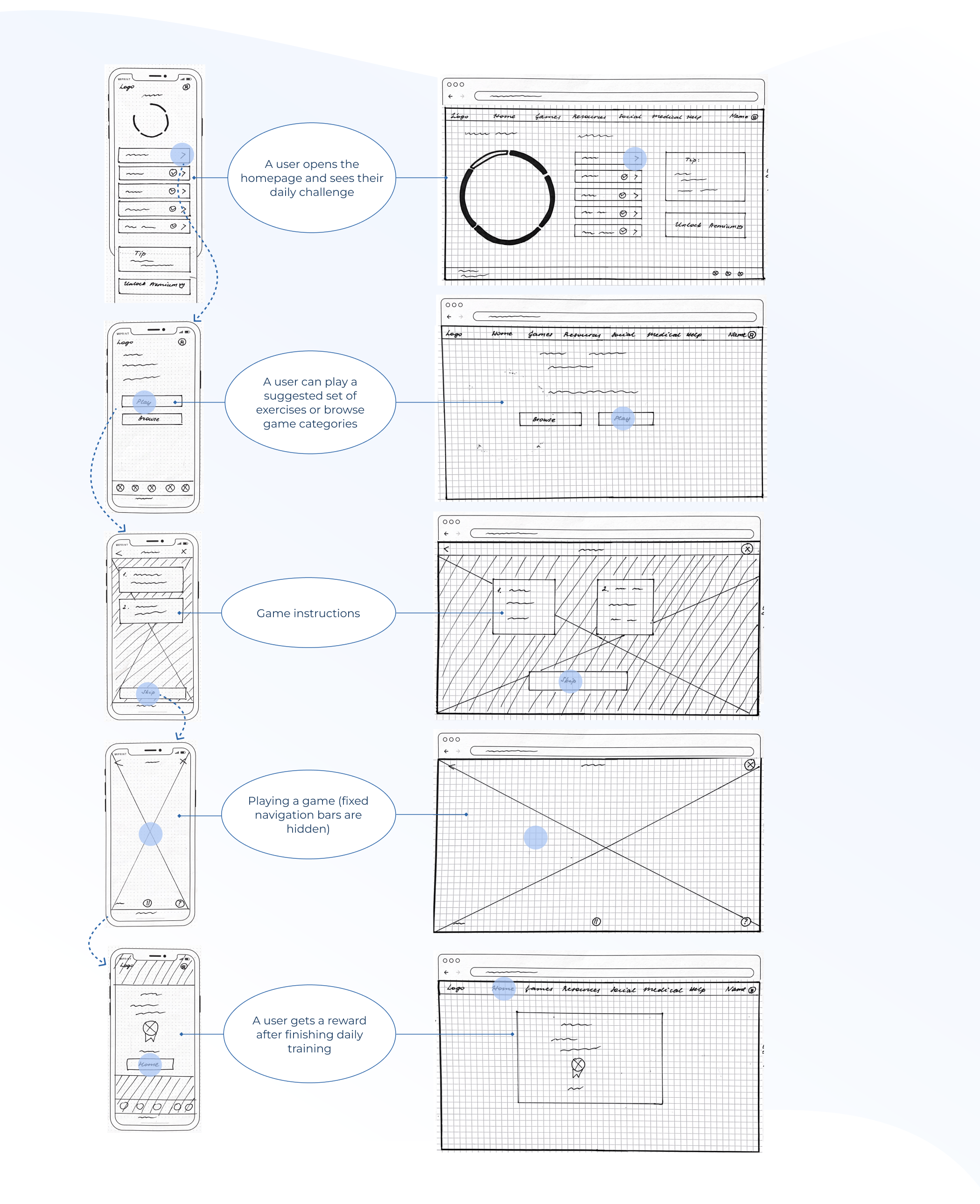
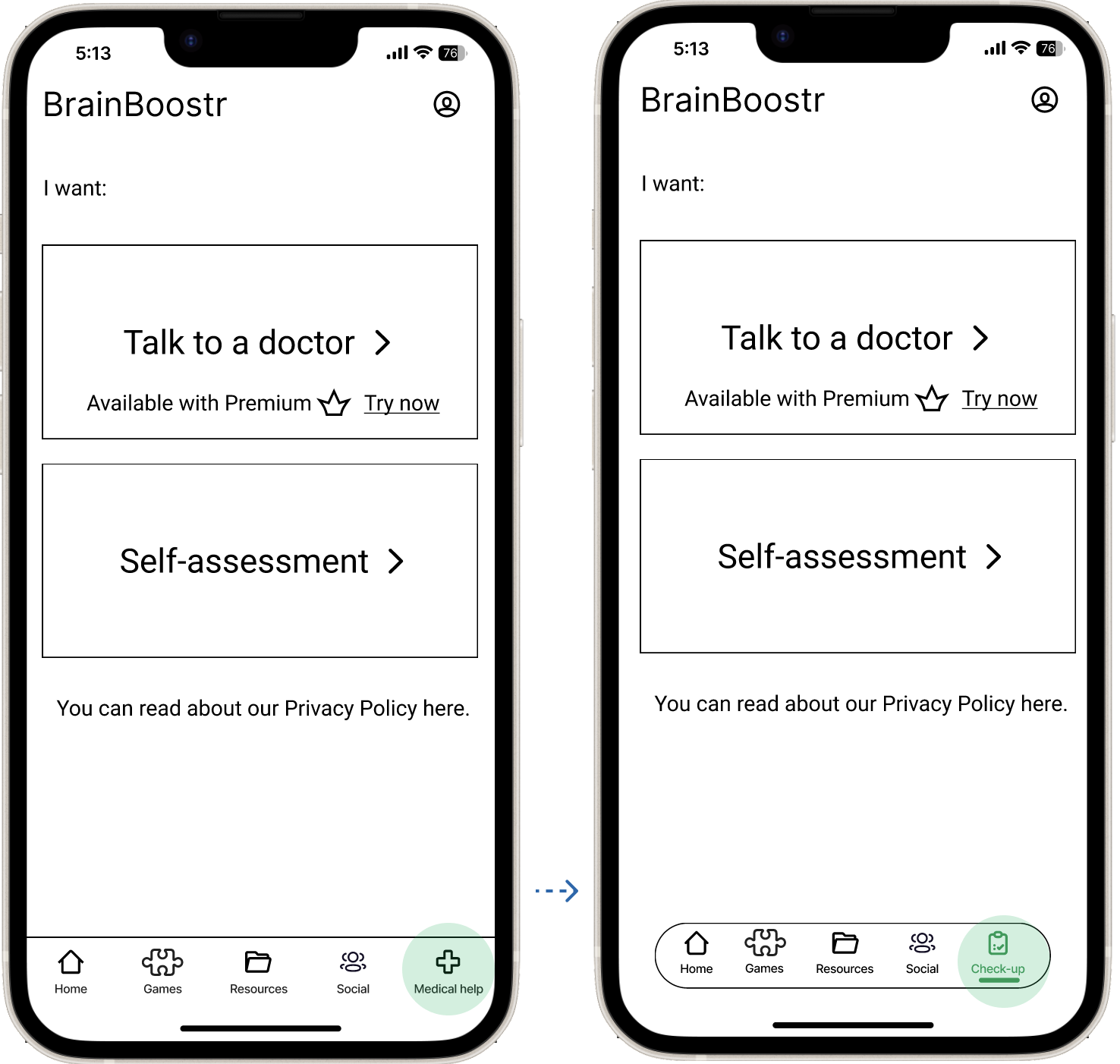
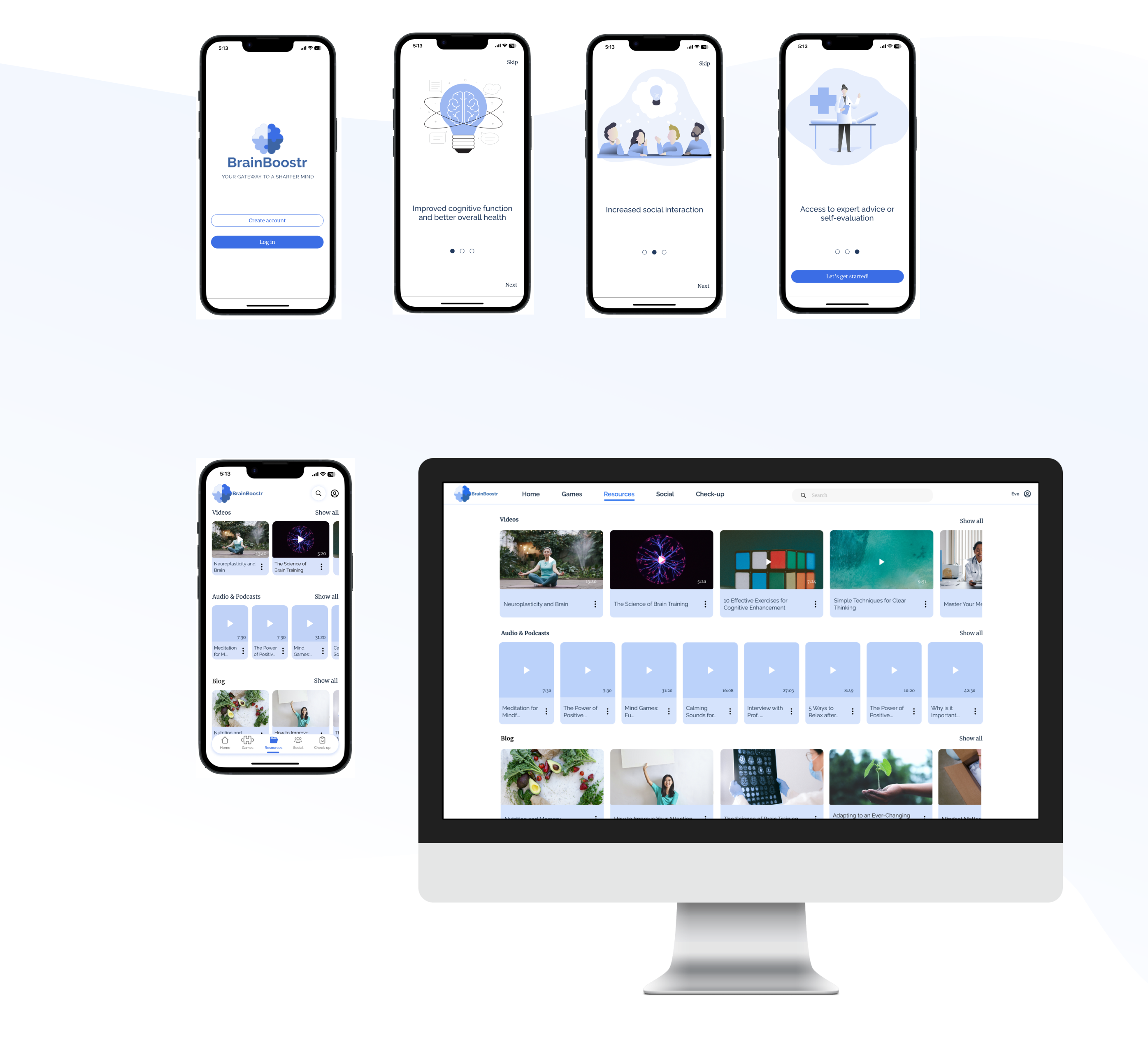
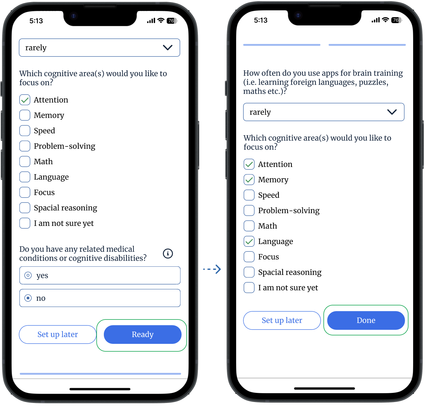
Then I started sketching paper wireframes for onboarding and three main features. The following one represents a flow for Playing a game for brain training:
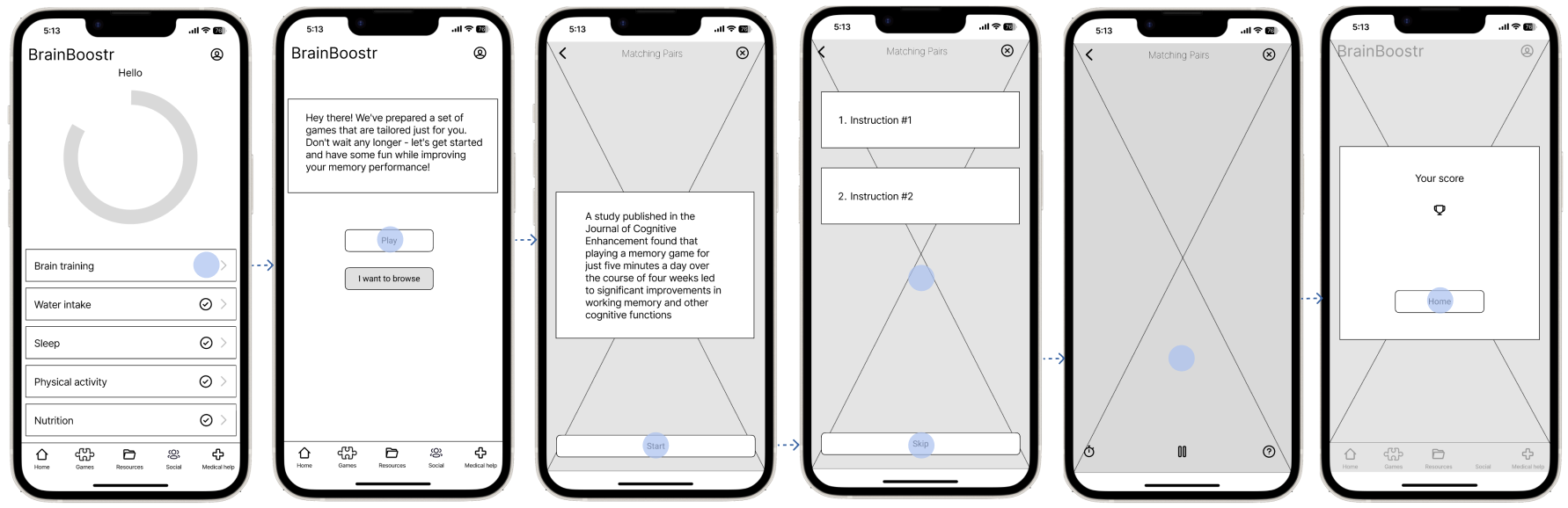
After I was satisfied with how the main screens and flows looked, I transferred them into a digital mid-fidelity format using Figma and started preparing for the first usability study:
This stage was no less exciting than the previous one, due to fresh perspectives and insights gained from participants who were 6 individuals from my personal network and student community between 30-50 y.o. and who have engaged in a brain-training activity at least once (to ensure they are close to the target audience of BrainBoostr). Their basic demographic information can be checked here and for a detailed look at the Test Script, including a list of all tasks tested, feel free to explore the complete script.
All online and moderated in-person sessions went well, and since it was emphasised that we were testing not participants but a product, I have managed to gather quite a lot of valuable feedback (the detailed version of the usability test results is here):
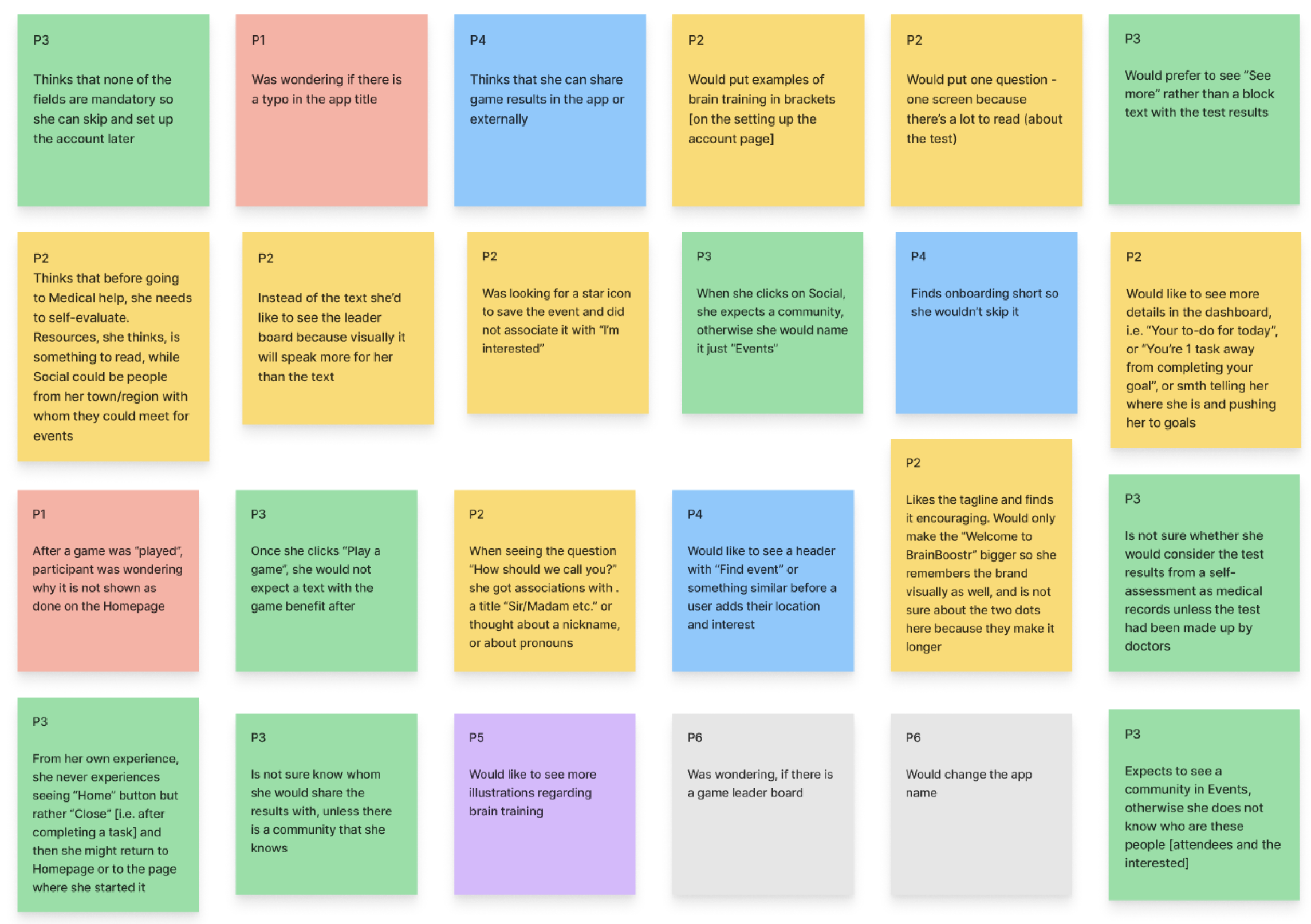
Excerpts from the affinity map and rainbow spreadsheet
My general findings from this usability study were that
- It is necessary to check links before sending to avoid sending wrong links and followed delays
- It is better to allocate more buffer time and set more time for each session in case some of them take longer
- A moderator should be ready to improvise and modify the test script when needed.
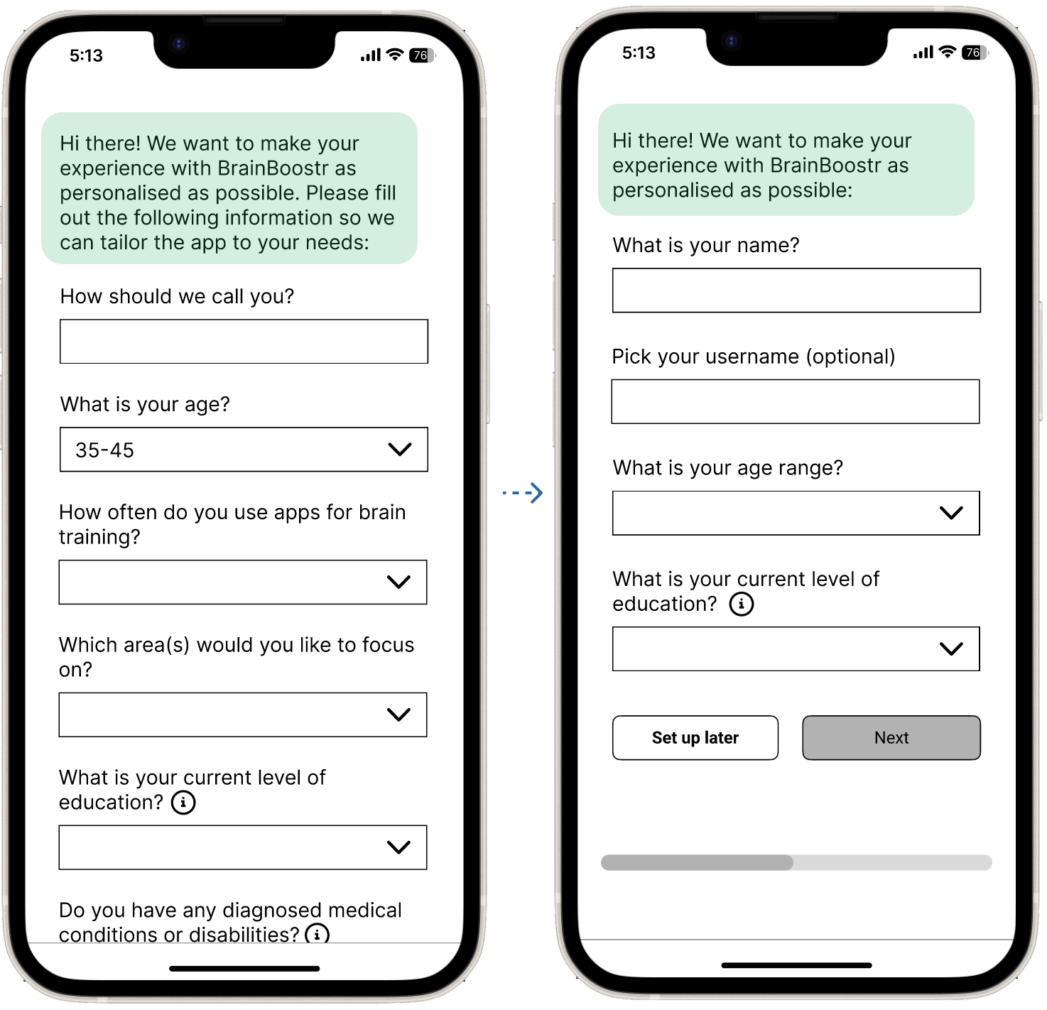
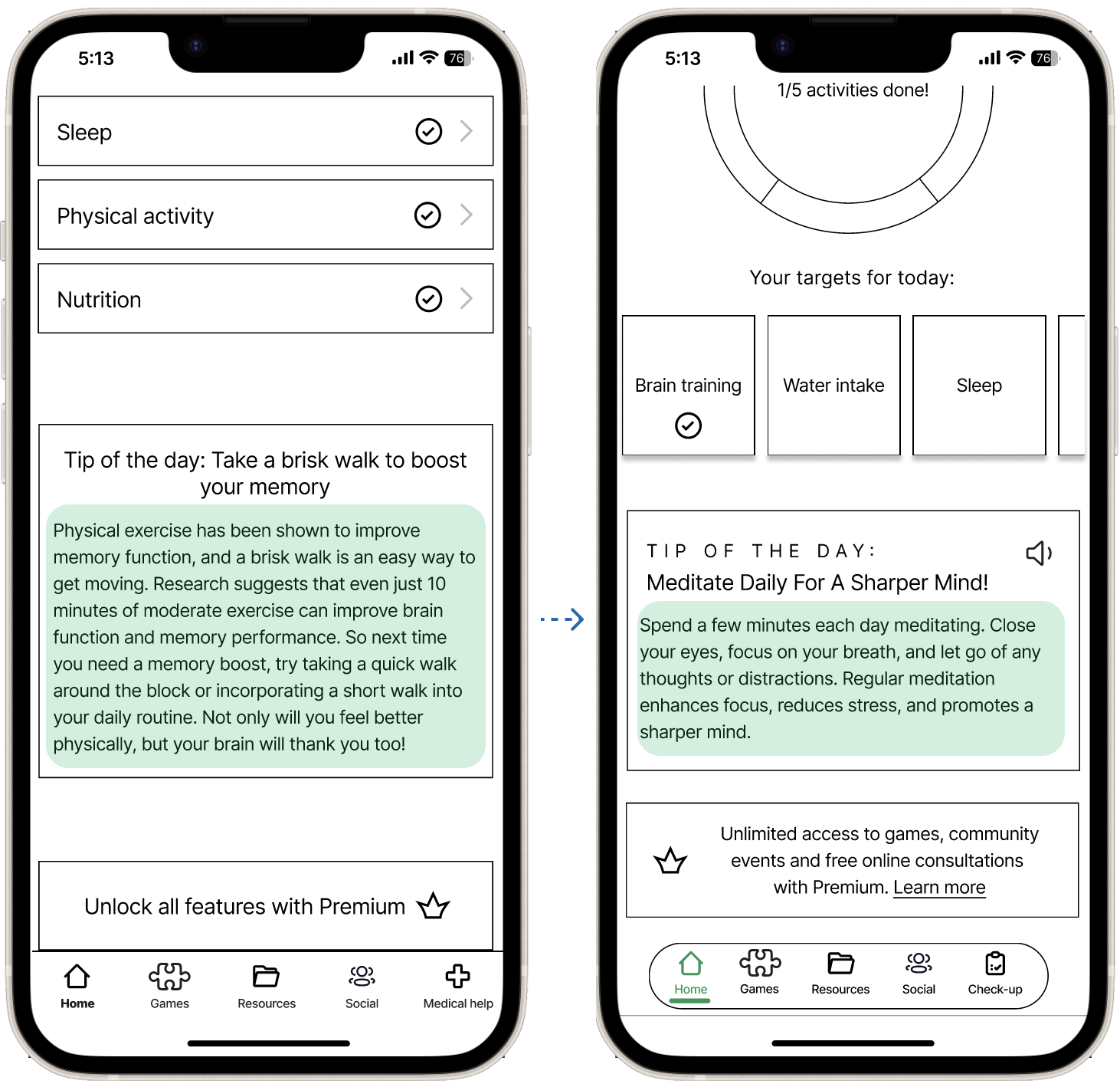
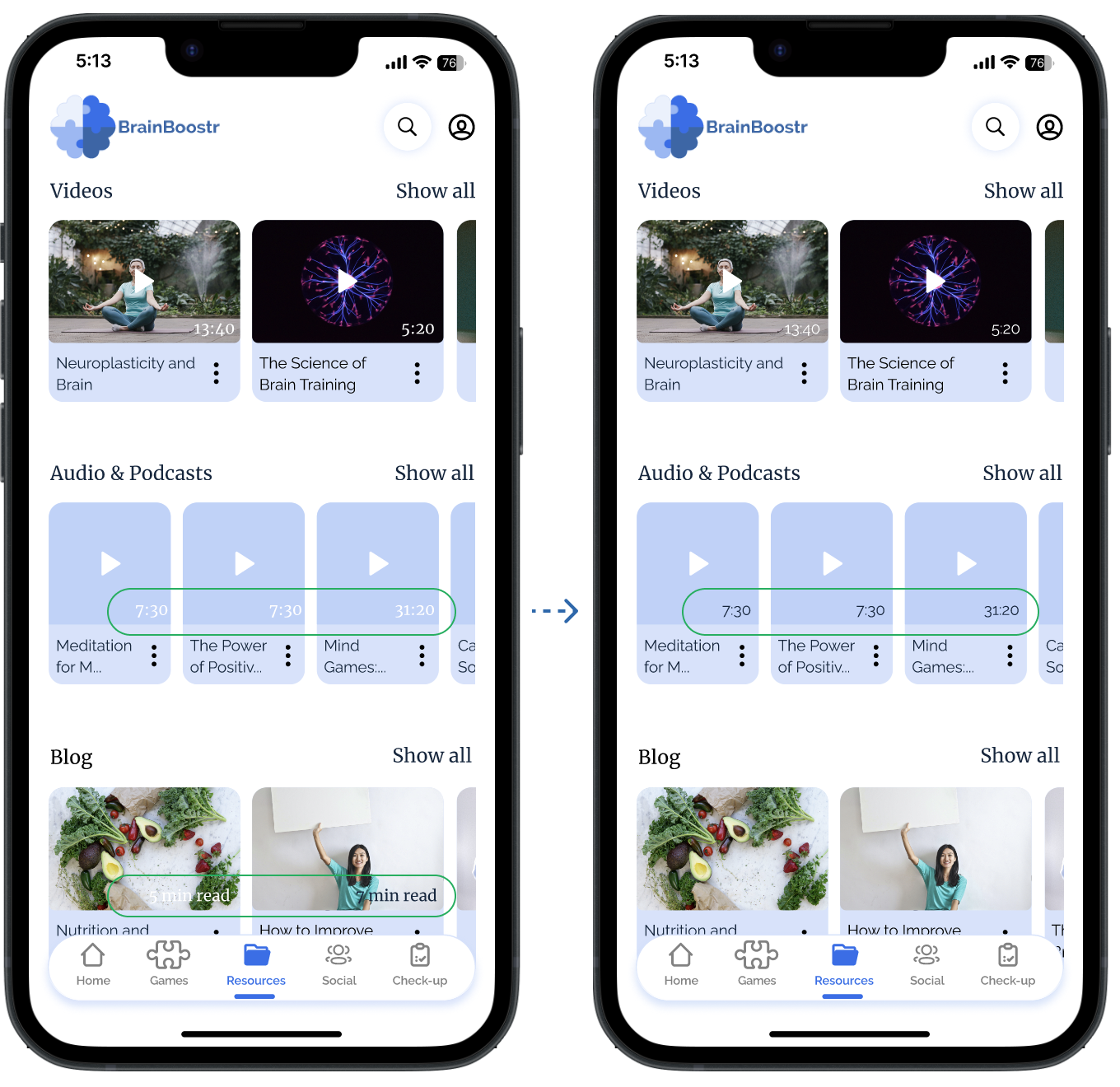
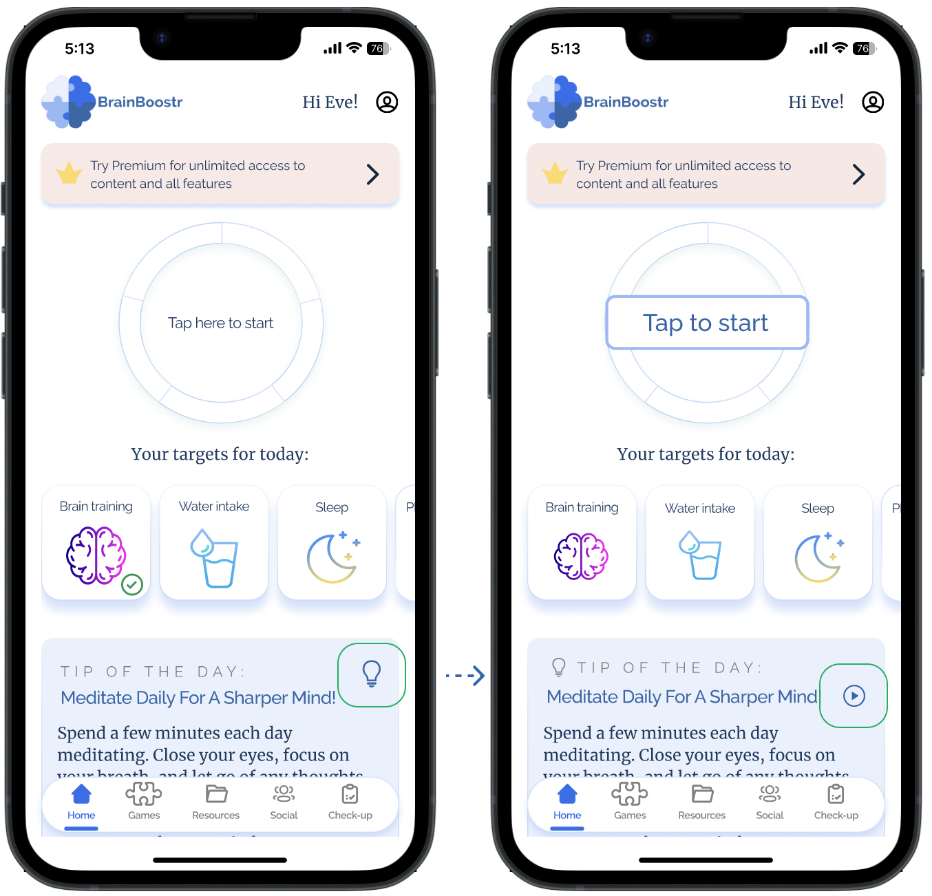
And as for the app iterations, I have grouped the issues by severity from high (preventing users from completing the main user flow or from using a core feature) to low and updated the prototype. Here are several examples of followed updates:
After ensuring that the app functionality and navigation have been clear to users and usability issues have been fixed, it was finally time to move to the most enjoyable and creative part - adding typography, colours and images and polishing the design.
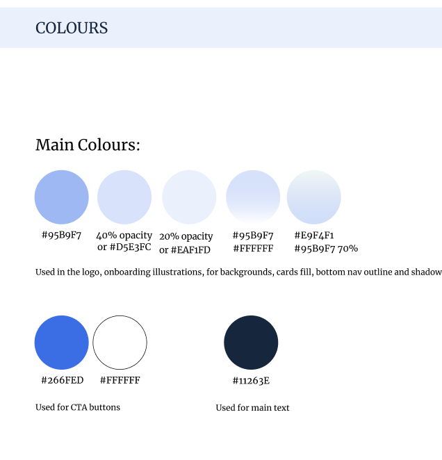
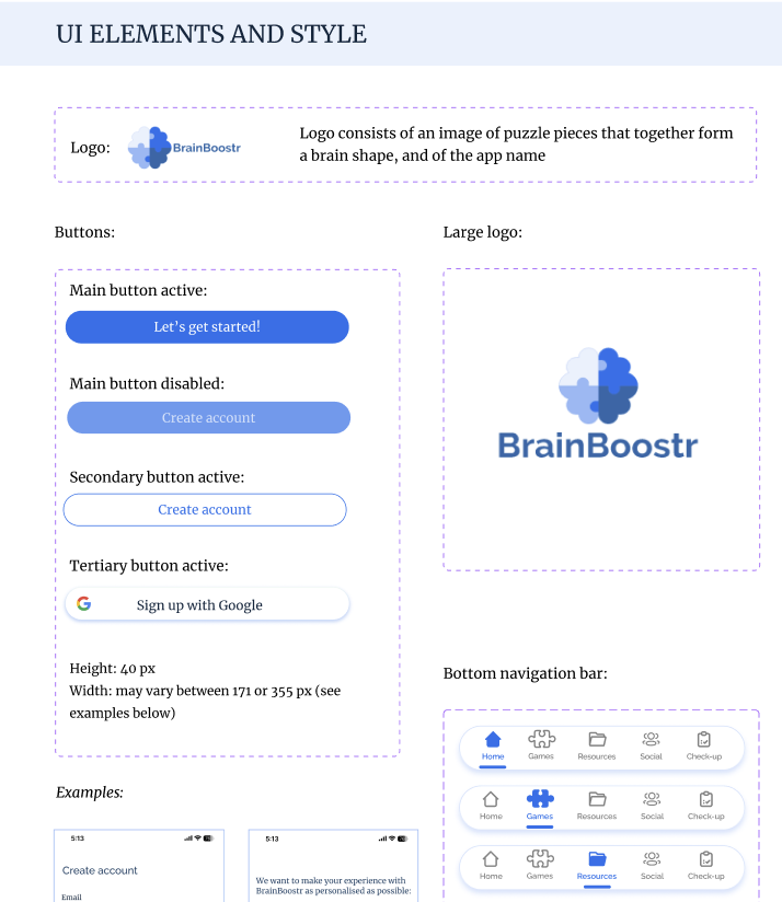
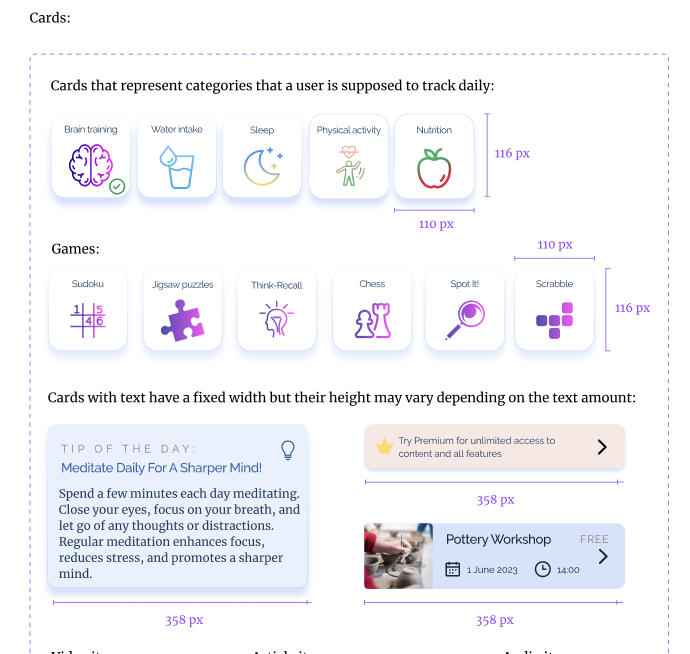
To gain consistency, keep the assets, colours and fonts in one style and get ready for a potential hand-off, I have documented the app design system (full version is here):
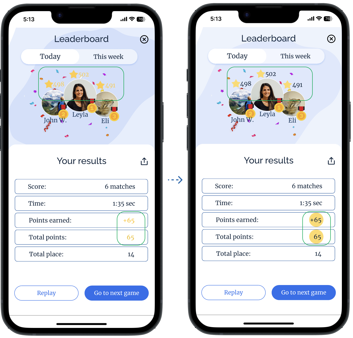
Further iterations were influenced by design collaboration sessions (=feedback from fellow designers) and by checking accessibility guidelines:
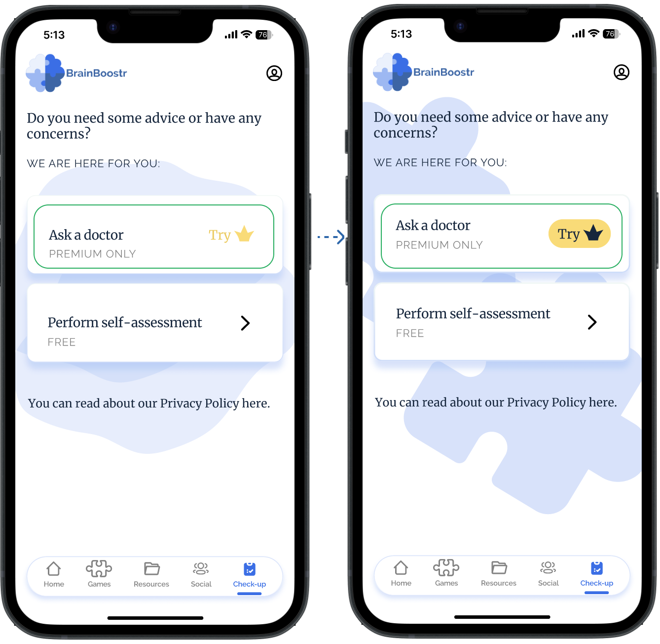
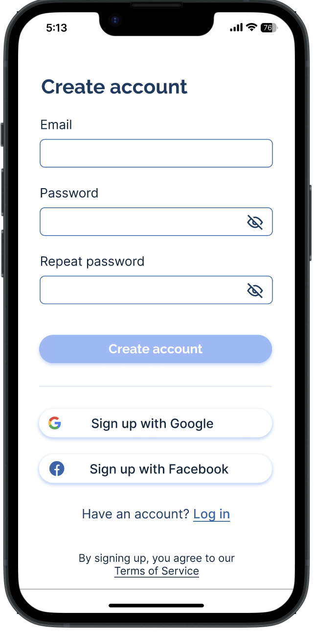
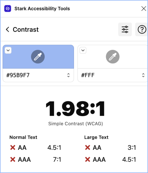
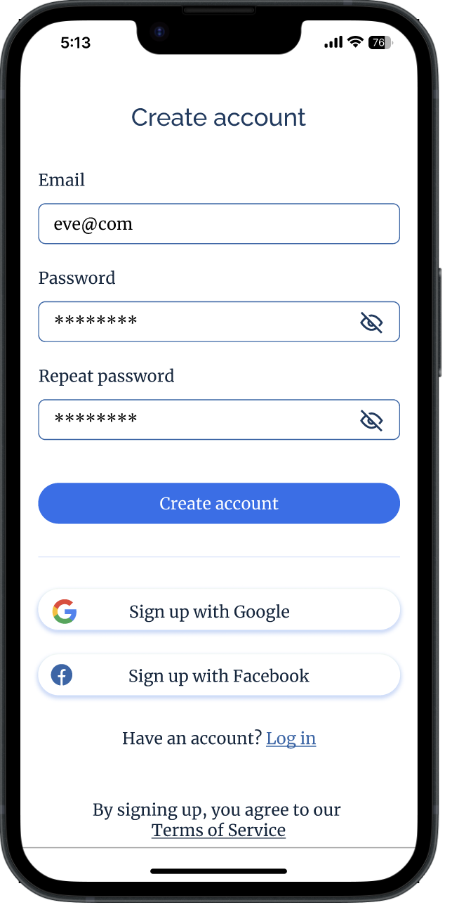
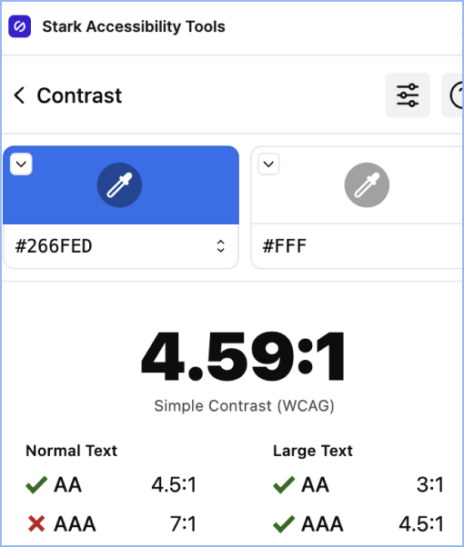
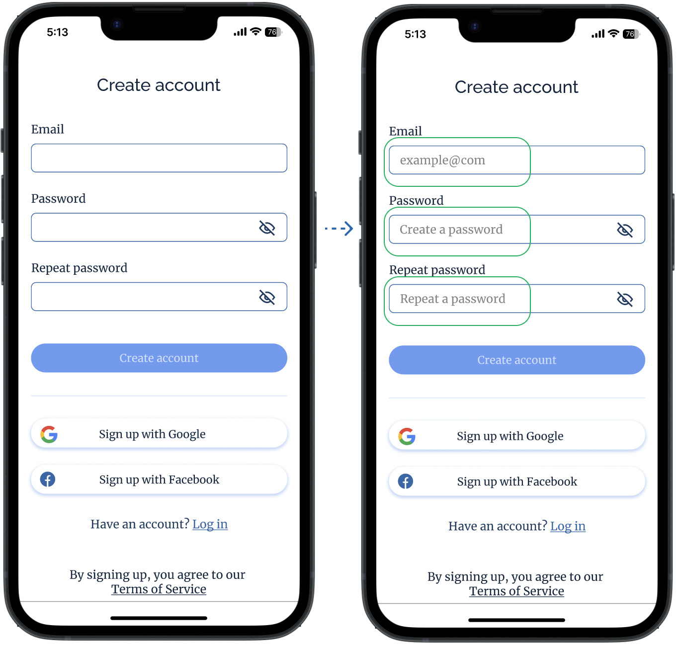
Originally, I was going to make CTA buttons in the main brand colour, however, it did not pass the contrast checker test (screenshots 1-2). So the background colour also had to be adjusted (screenshots 3-4):
Summary
Main Takeaways/Challenges
- I have learned that design is an iterative process, and something that I had envisioned before creating the app, turned out throughout the process not relevant/not aligned with accessibility standards or business needs, etc., that is why it is crucial to be able to adapt to current requirements and look for new solutions.
- Moreover, peer feedback, usability study sessions and a preference test showed that there cannot be a universal design that will please absolutely everyone because each user is unique with their preferences and tastes, so the important thing here is first of all to correspond to UI design principles and accessibility guidelines.
- During the process I was also challenged by trying not to get distracted by features/flows that are not the MVP, so in the end a couple of screens and interactions have been deleted.
What I Would Change
All in all, the objective of the project has been achieved (approaching the problem and coming to a solution from different angles), however, I would still try to:
- Interview a larger number of individuals to get more specific insights.
- Dedicate more time to UI design and its polishing
Going Forward
I would like to improve the design of the homepage and namely the graphics representing daily goals, making them more engaging and trendy. Besides, it would be nice to work on the mockup game interface, its animations and effects to make it look more realistic. Maybe I will also add more screens to show micro-interactions or extra pages to show a more detailed experience (profile page, account page, tracking etc.).
Thank you for reading about the process of creating BrainBoostr!
Illustrations credits: Freepik
Back to Projects →